Expand the Awesome: Design for a Wider Audience
This is a text version (more or less) of the talk I gave at BarCampLondon 7, because I don't think the slides will be of use to anyone who wasn't there. It isn't exactly what I said, because that was then, this is now, the talk wasn't recorded and I can't remember exactly what words I used. There were 34 slides and I did the talk in around 20 minutes (although writing it up has taken exponentially longer, weirdly), so feel free to grab yourself a cup of tea (or other beverage of choice) before you start reading.
I started off doing the time-honoured "show of hands" routine, asking first designers and then developers to raise their hands. I was a little surprised that the room seemed to be mostly developers.
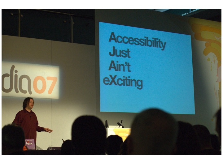
I then asked the room how many people agreed with the sentiment of "Accessibility Just Ain't eXciting", and after a slightly awkward moment where people looked at each other as if to say "can we admit this?", several people nodded in agreement.
Now, I don't believe that Jeremy really thinks accessibility isn't exciting because we've had conversations about it over the years I've known him, and I know that he was being very tongue in cheek with this slide, but I took this particular photo of his slide because I sat in the audience when this slide came up and was aware of several hundred people exhaling in relief and (some audibly, some not) saying "Yeaaaahhhhh…" as though they'd at last been given permission to admit that they really didn't like accessibility and found it boring.
I know that wasn't what he was going for, but one thing I've found over the years I've been talking about accessibility is that there are a lot of people who feel uncomfortable when thinking/talking about accessibility, and for whatever reason, don't want to think/do anything about accessibility. In essence, they're looking for someone to come along, pat them on the head and say "You've done enough accessibility, you can stop now" rather than "That's a good start, now how about this…?". The result is that they will hear what they want to hear, rather than what was explicitly being said.
A really good example of that is what happened in the aftermath of Joe Clarke's talk on "When accessibility is not your problem" at the same conference. A number of us were (rightly, as it turned out) concerned that the word "When" would be ignored by some of the audience, who would feel like they could stop doing accessibility now, because Joe said so.
It's a shame, because I genuinely believe that not only is accessibility and inclusive design a fascinating subject, but a real opportunity for designers to show their talent and creativity.
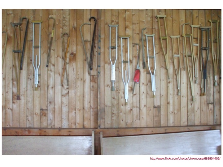
Then again, it's really difficult to get into that creative and excited space when the kinds of items that are associated with accessibility are ugly, boring and kind of scary devices, like crutches, wheelchairs and the like, which is why I love a quote I found from Helen Keller.
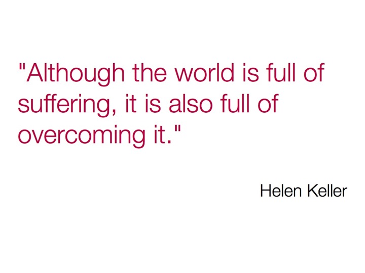
Although the world is full of suffering, it is also full of overcoming it.
The thing about disability is that although it can be an awful thing, it's not like people with disabilities sit around all day every day and think about how terrible their life is. If you've just experienced something which has changed your abilities (for example, being confined to a wheelchair, or losing your hearing), then yes, for a while you'll spend some time thinking about the extra limitations that have now been placed on you, but there comes a point where you just have to get on with life.
You adapt, adjust and overcome.
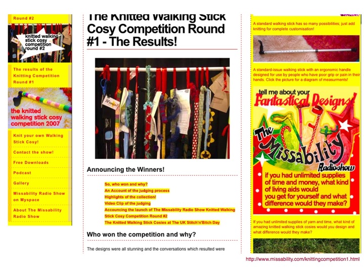
Like the people who knitted walking stick cosies, to cheer up ugly walking sticks.
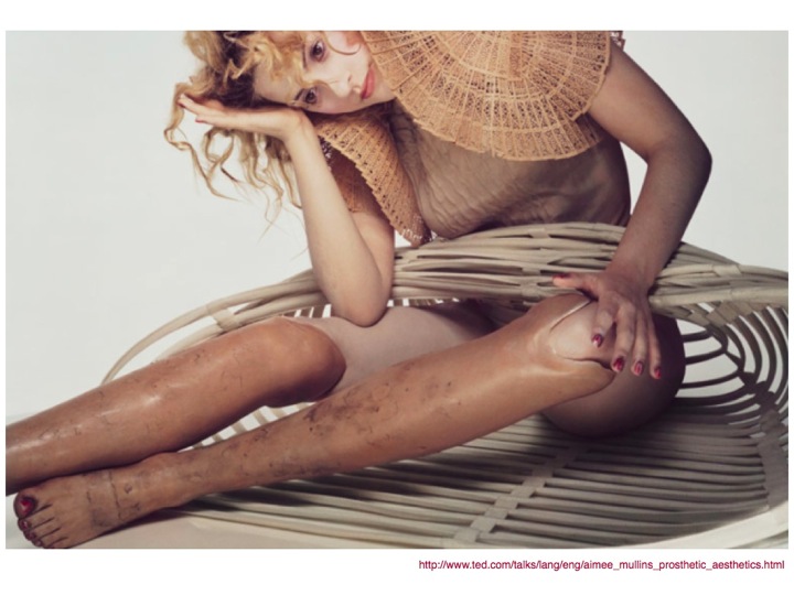
I first heard about Aimee Mullins from a TED talk, where she talked about her 12 pairs of legs. Go watch the video before continuing to read. I don't mind. In fact, I'd actively encourage it. She's an amazing woman. Come back here after though.
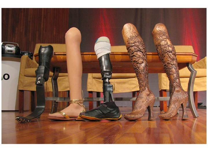
What I found most interesting about her is the notion that the goal for assistive devices or prosthetics should not be merely to replicate "normality", but instead to enhance and augment. Why should people who have a disability always be considered to be lacking in some way?
Why can't more design for specific needs be more integrated with design for "normality"? When it's done well, it can enhance the item, rather than detract from it (which is a common fear amongst designers who are asked to consider the needs of people with disabilities in their work).
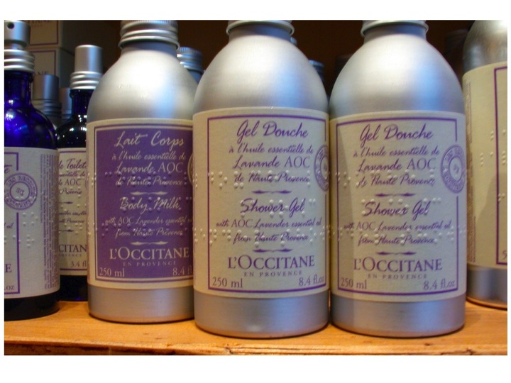
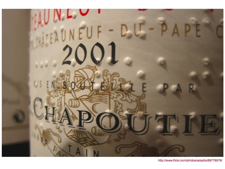
Having Braille on the labels of L'Occitane products and bottles of wine doesn't prevent someone who can't read Braille from reading the text that is also there. It also doesn't (in my opinion) make it look any less aesthetically pleasing. In fact, I think it adds to it (and I'm quite sure I'm not the only one. I've also seen lots of people exclaim over Braille on product labels in shops).
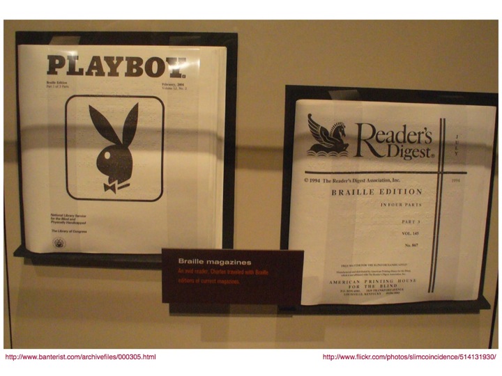
Although it might seem quite difficult to make some items accessible, or available in other formats, with a bit of thought, anything (pretty much) is possible. I still remember my delight when I found out about Braille Playboy early in my career at RNIB.
(as a side note, in searching for a picture of Braille Playboy, I found a great blog post entitled Playboy. In Braille., which is hilarious and well worth a read, particularly for the captions on the images. It makes me laugh just thinking about it.)
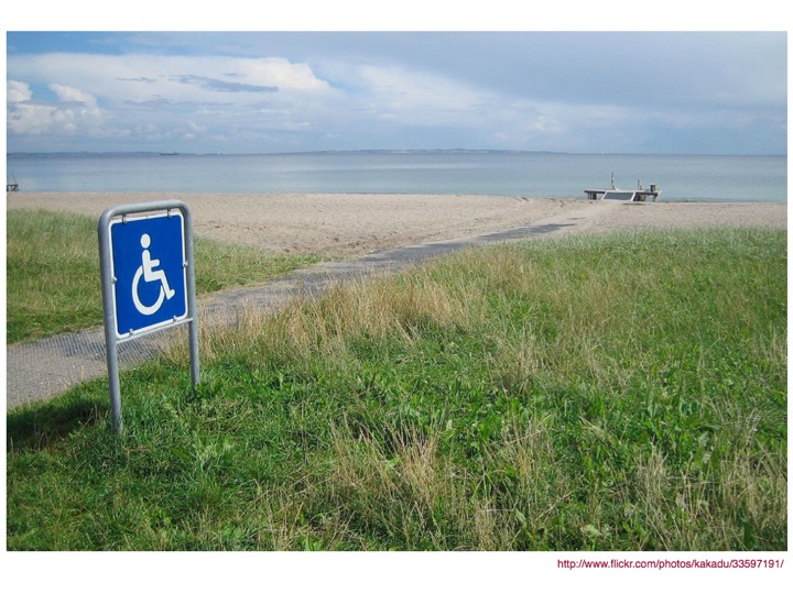
It's truly amazing what can be done with a bit of thought and effort. I would never have thought I'd ever see a wheelchair ramp on a beach, but I was delighted to find a picture of one. How wonderful that people in wheelchairs can experience the sea and sand (and attendant joys and nuisances of those things in combination with skin) independently, without having to rely on being carried, or giving up at the thought of how difficult it might be.
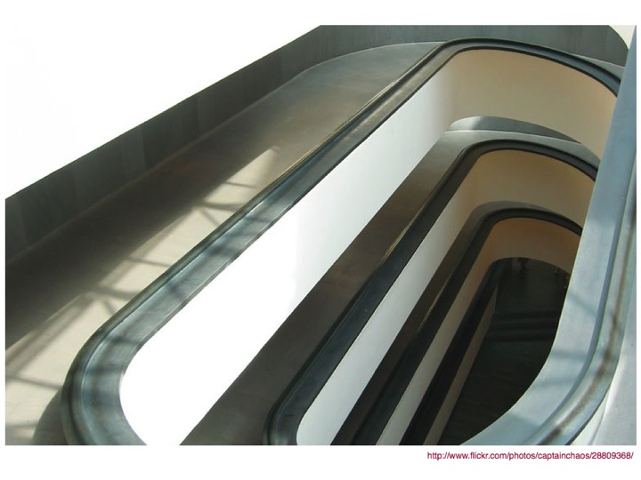
Similarly, it's amazing how beautiful these things can be. I love this photo of a ramp in the Vatican. I think it's a thing of architectural beauty, and I'm glad that they chose to make a feature of it rather than hide it away or install a lift. Now everyone can enjoy it, not just those in wheelchairs and their carers.
Which leads me to the concept of integration. All too often accessibility is tacked on at the end, not integral to the design, and that leads to ugliness, awkwardness and bad design.
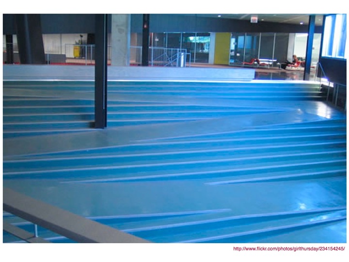
When searching flickr for photos of good examples of accessible design for a previous presentation, I found a picture of a ramp that had been integrated into a flight of steps. I thought it was a genius idea. Those who could use the steps could continue to use them, but those who needed the ramp didn't have to go out of their way (or get out of the way of the step users). Fantastic!
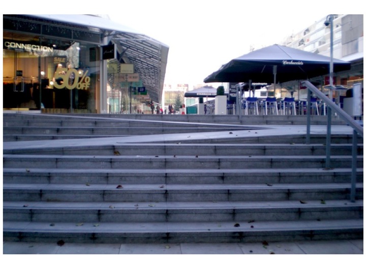
I was still quite excited about this find the next day when I was at work, and when I went out for lunch at the nearby Brunswick centre, as I had done many times before, I had a sudden realisation.
I'd been using something very similar. Pretty much every day. For months.
Without realising it.
The integration was so smooth that it just worked. For everyone. Wheelchair users. "Normal" people. Families with pushchairs. Elderly people with (or without) walking sticks.
It just worked.
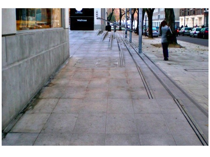
Even better, it didn't look ugly either.
There was no "Disabled users go here" segregation.
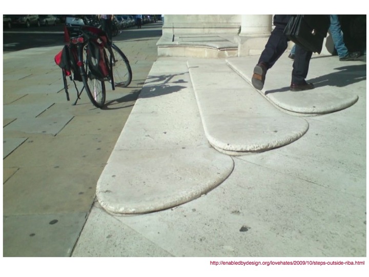
A post on Enabled by Design recently showcased the steps outside RIBA, another lovely example of what can be done when accessibility is integrated into the design process.
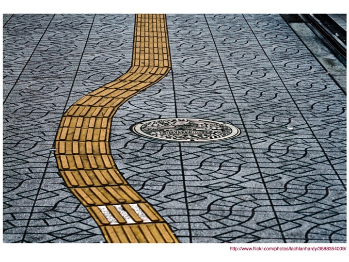
I also love this beautiful example from Japan of using tactile paving to guide people with sight problems around potential obstacles on the ground. In this case, pedestrians can, without any irony, follow the yellow brick road and in the process, avoid (in this case) potentially falling down (or tripping on) a manhole cover.
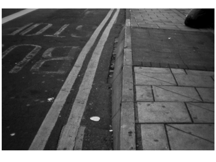
When I was in Bristol recently I had cause to use the local bus service, and it was only after three or so days of using it that I realised why the buses stopped in particular places.
At pretty much every bus stop I saw, there was a ramp built into the pavement, making it easier to get on and off the bus for everyone, never mind those with pushchairs or wheelchairs.
The ramps weren't an eyesore as they were built as part of the pavement, and they didn't stop anyone from using the pavement either.
A great example of design for a specific need that has wider benefits.
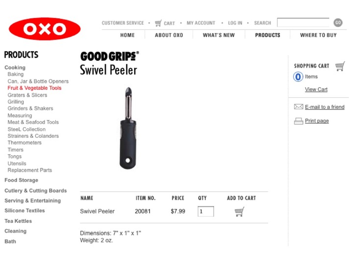
I love the OXO Good Grips range of kitchen tools.
The inspiration might have come from a wish to alleviate the discomfort of arthritis, but the products aren't marketed as being for disabled people, or even to alleviate disability problems.
OXO Good Grips case study from the Design Council
The OXO GOOD GRIPS Swivel Peeler is simply the best peeler you will ever try! The sharp, stainless steel blade glides through even the toughest fruit and vegetable skins with ease. The soft, comfortable handle cushions your hand as you peel, and is non-slip, even when your hands are wet.
Nowhere in the marketing copy does it mention the need to have a problem to buy or use the product. Instead it focuses on the benefits to the end user.
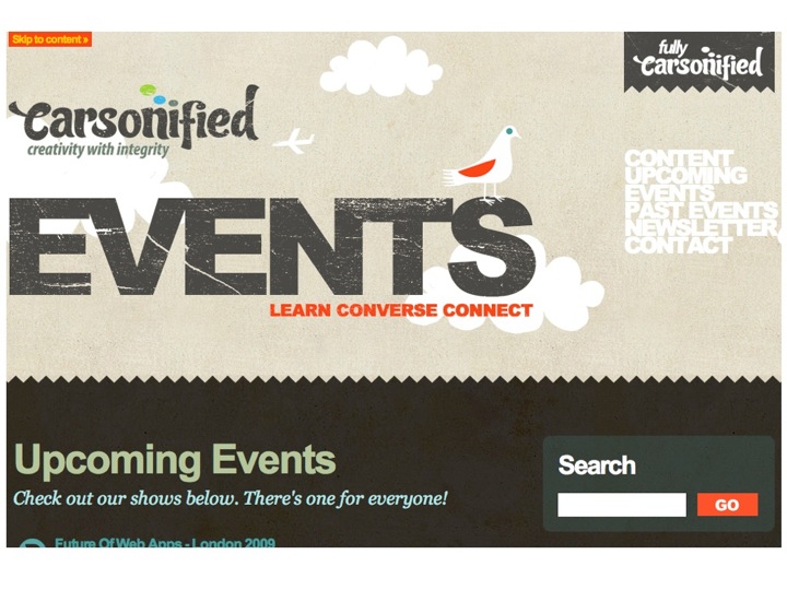
It's not just the built environment where this integration can take place. It can (and should) be implemented online.
I probably wouldn't go as far as to claim that the Carsonified Events page is the ultimate in accessible design, but it was the first seriously high profile site aimed at the design community that I've seen implement a visible Skip link.
It doesn't get in the way for those who don't need it, but could be a real boost for people who can see just fine and can't use a mouse, enabling them to jump over any navigation links.
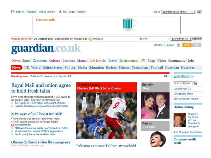
The Guardian website has a really nicely implemented text resize widget. Clearly visible, and available to any and all who might need it. Yes, the use of text resize widgets is still controversial in the web accessibility community, but it can be a useful usability aid. Not everyone needs to use it, but equally it doesn't harm anyone else's experience by being there.
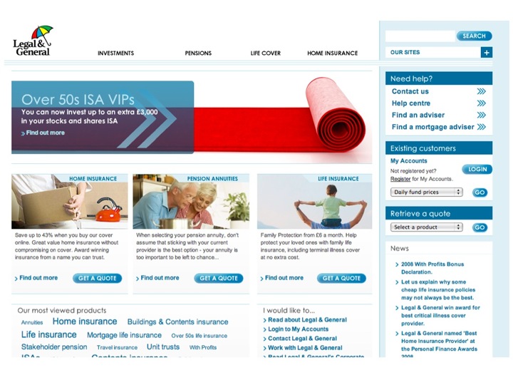
Which brings me on to the Legal & General website. It isn't boring and ugly, the all too often expected hallmark of accessible/inclusive design.
It's no longer news in the accessibility community, but it remains the best example of a solid business case for including accessibility as part of the design process.
Just a snapshot of some of the figures from Mike Davies' Presentation to the London Web Standards Group meeting.
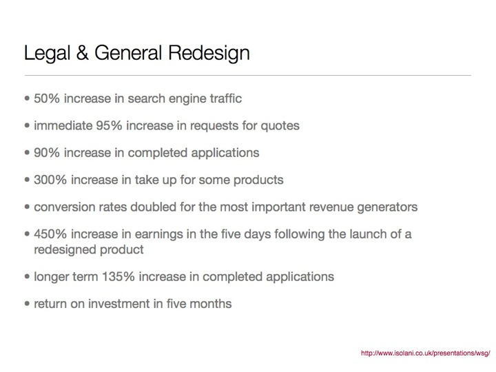
- 50% increase in search engine traffic
- immediate 95% increase in requests for quotes
- 90% increase in completed applications
- 300% increase in take up for some products
- conversion rates doubled for the most important revenue generators
- 450% increase in earnings in the five days following the launch of a redesigned product
- longer term 135% increase in completed applications
- return on investment in five months
In the current financial climate, I honestly can't believe that any business can afford to ignore figures like these. The increase in sales as a result of making the site accessible didn't, for the most part, come from people with disabilities. It came from "normal" people. Making the site easier to use for people with disabilities made it easier to use for everyone, and as a result, more people bought the products.
If you're designing, building, making, selling anything, why wouldn't you want even more people to find it, read it, use it, buy it, think it's awesome?
As I hope I've shown, Inclusive Design doesn't have to be ugly. It can be a thing of beauty that's a delight to use, whoever happens to be using it.
It's easy to say, but I do think that Accessibility is kind of like an extreme form of Usability. If a product is easy to use by people with impairments, it is highly likely to be easier to use by people who don't have impairments.

It's no use me saying that people should design sites (or whatever) for a wider audience without giving some hints and tips on how this can be done.
For the purposes of this, I'm talking about websites or computer interfaces, but a lot of this can be applied to other things.
It's also necessarily brief and high level. For more detail, you could have a look at Designing Accessibility Into Themes, which I wrote earlier this year for the Drupal 7 User Experience project or contact me for some training or consultancy.
If you want people to read your content/buy your stuff, you need to make sure they actually can. Good typography is incredibly important. Choose an appropriate typeface, ensure that the text is of a decent size (and can be resized), ensure that there's sufficient contrast between the text and the background colour and a decent amount of space between lines (but not too much).

Make it pretty. Don't be afraid of using colour and images to make things look better. Pretty things make people happy. Happy people are happier, and often buy more stuff.
Just make sure that while you're making it pretty, you're not making it more difficult to read and/or use.
Use clear and simple language (where appropriate). The easier you can make it for people to understand what you're offering and what benefit it can bring to them, the better. Obviously, this doesn't apply to scientific texts or suchlike, but if you're selling a product or a service, making it easier to understand can only broaden your audience and by extension your client/user base.
One of my pet hates with form design is this proto-convention which has developed which places the form label above the input, and any help text after or below the input.
It just doesn't make sense to give the user the information they need after they need it. If you need a user to take a specific action, or give you a bit of information in a specific format, tell them before they enter it.
I know it might seem obvious, but it's still far from the convention, and I'd like to see that change.
Make sure your interface works with keyboard only as well as with mouse. In fact, unplug your mouse (and/or disable your trackpad) and spend some time using the keyboard only.
It's not the be-all and end-all, but if your site works without needing to use a mouse, you're a good way towards it being more accessible and easier to use (and I can pretty much guarantee that you'll find at least one thing that will make you rethink your interface).
Design a really good base interface. Make sure that the user experience for people who don't have or can't use a mouse, javascript whizzbang whatevers and all the rest of it is a good one, then build on that rather than try and retrofit functionality based on all the shiny and whizzy interface bits you've designed. It'll be far more difficult and it's more likely to lead to compromises in the visual design.
Anyone using the base interface shouldn't feel like they're missing out on something.
It's far easier to start from a good solid base and then iterate, adding nice functionality and interactivity along the way (making sure that whatever you're doing isn't making whatever it is more difficult to use).
For example, if you're building a user interface which displays styled tooltips when you hover your mouse over a particular element, think how those elements could be incorporated into the design if you don't have javascript/whatever available. Are they important or are they nice to have? If they are important, then design them into the base interface. If they're not important, it's fine to have them not appear. It's also really important to duplicate any hover-based functionality so that it appears when the item is given focus so people who can't use a mouse can still use it.
This isn't just for people with disabilities - iPhone (for example) users can't make content appear on hover when they're looking at a website in mobile Safari.
One final story. A few years ago RNIB held a series of awards, one of which was for Best Website. It was to be nominated for and voted on by blind and partially sighted people. We thought that it might throw up some really fantastic accessible websites that we didn't know about, and allow us to use them as examples of how great these could be.
We were wrong.
The sites that were most nominated were sites like play.com and Amazon. This was before the lawsuit requiring Amazon to make their site more accessible to blind and partially sighted people, when most of the images on the site didn't even have alt text. Not exactly a shining example of accessibility. What it had going for it was compelling content. People wanted to use the site so much that they'd found or developed coping strategies that would enable them to use the site.
Coping strategies are all well and good, but we don't all offer something as compelling as cheap books and CDs, and users may not put the effort in to find workarounds for accessibility or usability barriers. More often, they'll go somewhere else if they can.
At the end of the day, inclusive design is a real opportunity to bring the awesome that is your creation to a wider audience, and really, why wouldn't you want even more people to love/read/buy your stuff?
If you're interested in reading a bit more about inclusive design, I can heartily recommend reading Design Meets Disability by Graham Pullin
If you've read this far, thank you. I could have gone the easy route of just throwing the presentation slides up on slideshare or recording a screencast, but neither of those felt like they would particularly capture the essence of what I was trying to convey with my talk. Hopefully, this does a good enough job.