Ridiculous Spam Prevention

A week or so ago I agreed to help the lovely Natalie of The Yarn Yard move her blog from Typepad to Wordpress. We talked through what she wanted, and she identified a theme that she liked. I'm not going to identify it, because I think it'd be counter productive, but it has a killer feature that she really likes.

Unfortunately, the documentation is a bit lacking, and in looking to make a specific change to this killer feature, I found that I needed to consult the support forums.

So far, so good.

Except, all the support I can find tells me to find line 40 of header.php (which I did) and look for specific code and change it.

Easy.

Except that line 40 doesn't look like the specific code any more, and I can't find any bit in any of the files that does (and believe me when I say that I've tried, and I've searched).

So I decide to bite the bullet, risk the revocation of my geek card, and ask for help in the forum.

Except, to do that, I have to register, and that's where the fun starts.

Before I begin, I want to make this clear. The forum is a support forum for two themes. One for Wordpress, one for another CMS.

So I start to fill in the registration form, not really reading the help text with the labels, because I've filled out a million registration forms before.

Username: the usual Email address: the usual Confirm email address: *yawn* Password: blah Confirm password: blah again

Ignore language and timezone

Then the wheels fall off the wagon.

Antispam: (no, I'm not a spammer)

Secret code: You what now?

There's a big pile of help text under that label, telling me to send an email to an email address to get a code, to prevent spambots. I'm thinking to myself that this is a bit of overkill, but I do it anyway.

While I'm waiting I go back to the form to answer the next couple of questions.

Human: Yes.

Are you going to do bad things to my forum?: (I wasn't before, but now I'm considering it. Only kidding. No.)

By this point the email with the code shows up. I enter it, and move on.

To find that, after having completed FOUR different CAPTCHA type devices, including sending an email for a secret code, I now have to fill out an actual CAPTCHA.

By this point, I'm wondering if this guy is serious, and whether he's protecting the treasure of the Sierra Madre, or whether I'm on some kind of eyetracking version of Candid Camera, but I complete it anyway, and hit submit.

To be thrown back with an error that my username is too long. It has to be between 3 and 8 characters, which means my usual username is out.

Okay.

Change that, redo CAPTCHA, hit submit.

Another error. Password too short. Of course, because it deleted the password I entered the first time (but not the copy of it in the second confirmation, curiously). Change that, redo CAPTCHA again, hit submit.

Okay.

Then I get a message telling me I have to wait for an email to activate my account before being able to ask my question.

In fairness, he does acknowledge the hoops and there's a message saying thanks for jumping through them, but that's doing little to soothe my irritation.

So I have a whinge on twitter about it, while I wait for the confirmation email to show up, which it does, a couple of minutes later.

With the username and password provided in clear text.

Now, I've seen a lot of crappy websites in my time. I've registered for a lot of forums in my time. I've been annoyed by user experiences in my time, but rarely have I felt so motivated to send a very strongly worded email to the owner of a forum (I think the last time was when someone suggested that my colleagues and I should be horsewhipped, for something which we had no control over, but that's a whole other story).

I am quite flabbergasted that someone who sees fit to implement stringent (and seemingly arbitrary) limits on usernames, plus five different CAPTCHA security devices (including an inaccessible actual CAPTCHA) doesn't give the users he's forced to jump through hoops to join his support forums the same kind of respect for their security.

I've now changed my password on that forum (which in itself was a UX nightmare), but I'm still quite astonished.

I understand that spam is a problem on online forums (and everywhere else), and I understand that CAPTCHAs go some way to slowing down (if not entirely stopping) the deluge of spam, but I just don't believe that putting the user through so many hoops is acceptable under any circumstances, let alone for something so basic as a support forum.

Rather than make me feel safer, it's irritated me to the point that I've just written over 800 words about how irritated I am with this, rather than writing about how much I love the TV series Chuck, which is what I was going to write.

More to the point, it makes me seriously reconsider using the Theme, because if he's that lax with security on something as basic as a forum signup email, I can't even begin to trust his code, which is a shame, because that killer feature in the theme was pretty nice.

Please review ATAG2.0

I'm part of the W3C's Web Accessibility Initiative (WAI) Authoring Tools Accessibility Guidelines (ATAG) working group (phew, that's a mouthful) and during the week, we published a new working draft of the new guidlines (ATAG2.0) along with a new "Implementing ATAG 2.0" guide. The official call for comments sent to the WAI Interest Group (IG) went like so:

Dear WAI Interest Group Participants,

The Authoring Tool Accessibility Guidelines Working Group invites you to comment on the updated Authoring Tool Accessibility Guidelines (ATAG) 2.0 Working Draft published 29 October 2009 at: http://www.w3.org/TR/ATAG20/

The draft integrates revisions in response to the comments of the 21 May draft as well as a substantially revised document, Implementing ATAG 2.0 that replaces Techniques for ATAG 2.0. In this draft, the Working Group made the following substantial changes: * Revised how authoring tools should support authors in making choices that improve accessibility. * Revised the former Techniques document to better serve developers, and changed the title to: Implementing ATAG 2.0.

Specific changes and questions for feedback are listed in the Status section: http://www.w3.org/TR/ATAG20/#status

ATAG defines how authoring tools should help Web developers produce Web content that is accessible and conforms to Web Content Accessibility Guidelines (WCAG) 2.0. It also defines how to make authoring tools accessible so that people with disabilities can use the tools. ATAG is introduced in the ATAG Overview at: http://www.w3.org/WAI/intro/atag.php ATAG is part of a series of accessibility guidelines/standards developed by WAI, which are listed in WAI Guidelines and Techniques at: http://www.w3.org/WAI/guid-tech.html

WAI encourages you to review the update ATAG 2.0 documents and submit comments on any issues that you think could present a barrier to future adoption and implementation of ATAG 2.0. Please send comments to the publicly-archived list: public-atag2-comments@w3.org by 30 November 2009

For more information, see: * How WAI Develops Accessibility Guidelines through the W3C Process http://www.w3.org/WAI/intro/w3c-process * Authoring Tool Accessibility Guidelines Working Group (AUWG) http://www.w3.org/WAI/AU/

Please let us know if you have any questions. Thank you in advance for your comments.

Feel free to circulate this message to other lists; please avoid cross-postings where possible.

Regards, ~Shawn Henry and Judy Brewer, W3C WAI On behalf of: Jutta Treviranus, Chair of AUWG, and Director of the Assistive Technology Research Center, University of Toronto Jeanne Spellman, W3C Staff Contact for AUWG

If you're at all interested in accessibility (or even if you're not) and you build any kind of tool or application that can be used to create content, you really need to be having a read of these and making comments if there's anything you have an issue with. These guidelines are an important part of the process of ensuring that web content, applications and software are accessible, and present an incredible opportunity to really lead the field in best practice, especially for CMS vendors.

If you were a brand, what brand would you be?

I was recently asked the question:

If you were a brand, what brand would you be? The actual brand that you are, not the brand you aspire to be.

The question came out of left field and I wasn't expecting it, so I stuttered a wee bit and delayed answering a bit by doing the old "good question…" dance. Mostly, if I'm honest, because I was trying to figure out whether it'd be worth answering truthfully the first thing that appeared in my head or going for the aspirational angle and being rumbled as arrogant or a poseur.

In the end, I went with the answer that first popped into my head, but I'm curious what your answer would be, if you were asked that question - and whether you'd be honest, or aspirational.

So, if you were a brand, what brand would you be?

Expand the Awesome: Design for a Wider Audience

This is a text version (more or less) of the talk I gave at BarCampLondon 7, because I don't think the slides will be of use to anyone who wasn't there. It isn't exactly what I said, because that was then, this is now, the talk wasn't recorded and I can't remember exactly what words I used. There were 34 slides and I did the talk in around 20 minutes (although writing it up has taken exponentially longer, weirdly), so feel free to grab yourself a cup of tea (or other beverage of choice) before you start reading.

Expand the Awesome: Design for a wider audience title slide

I started off doing the time-honoured "show of hands" routine, asking first designers and then developers to raise their hands. I was a little surprised that the room seemed to be mostly developers.

Jeremy Keith's @media 2007 slide which uses the term AJAX and shows it to mean 'Accessibility Just Ain't eXciting'

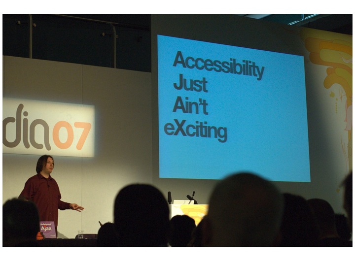
I then asked the room how many people agreed with the sentiment of "Accessibility Just Ain't eXciting", and after a slightly awkward moment where people looked at each other as if to say "can we admit this?", several people nodded in agreement.

Now, I don't believe that Jeremy really thinks accessibility isn't exciting because we've had conversations about it over the years I've known him, and I know that he was being very tongue in cheek with this slide, but I took this particular photo of his slide because I sat in the audience when this slide came up and was aware of several hundred people exhaling in relief and (some audibly, some not) saying "Yeaaaahhhhh…" as though they'd at last been given permission to admit that they really didn't like accessibility and found it boring.

I know that wasn't what he was going for, but one thing I've found over the years I've been talking about accessibility is that there are a lot of people who feel uncomfortable when thinking/talking about accessibility, and for whatever reason, don't want to think/do anything about accessibility. In essence, they're looking for someone to come along, pat them on the head and say "You've done enough accessibility, you can stop now" rather than "That's a good start, now how about this…?". The result is that they will hear what they want to hear, rather than what was explicitly being said.

A really good example of that is what happened in the aftermath of Joe Clarke's talk on "When accessibility is not your problem" at the same conference. A number of us were (rightly, as it turned out) concerned that the word "When" would be ignored by some of the audience, who would feel like they could stop doing accessibility now, because Joe said so.

It's a shame, because I genuinely believe that not only is accessibility and inclusive design a fascinating subject, but a real opportunity for designers to show their talent and creativity.

An assortment of cruches and walking sticks'

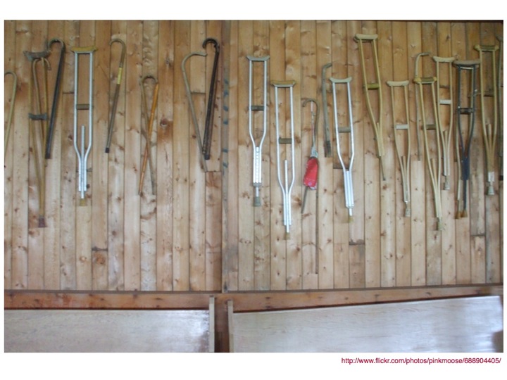
Then again, it's really difficult to get into that creative and excited space when the kinds of items that are associated with accessibility are ugly, boring and kind of scary devices, like crutches, wheelchairs and the like, which is why I love a quote I found from Helen Keller.

Helen Keller quote on suffering and overcoming'

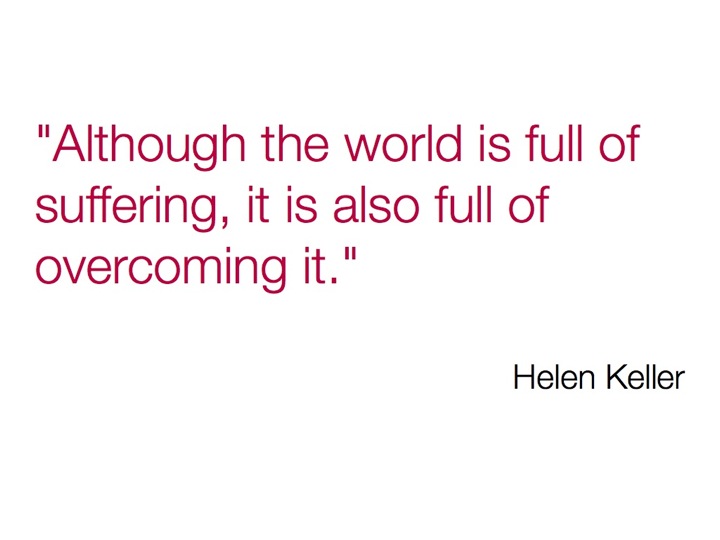
Although the world is full of suffering, it is also full of overcoming it.

The thing about disability is that although it can be an awful thing, it's not like people with disabilities sit around all day every day and think about how terrible their life is. If you've just experienced something which has changed your abilities (for example, being confined to a wheelchair, or losing your hearing), then yes, for a while you'll spend some time thinking about the extra limitations that have now been placed on you, but there comes a point where you just have to get on with life.

You adapt, adjust and overcome.

Knitted walking stick cosies

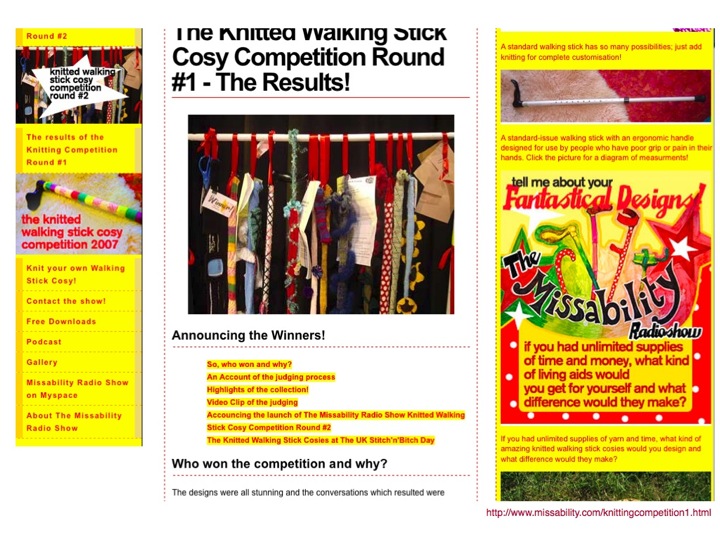
Like the people who knitted walking stick cosies, to cheer up ugly walking sticks.

Aimee Mullins modelling for a fashion line, showing her prosthetic legs'

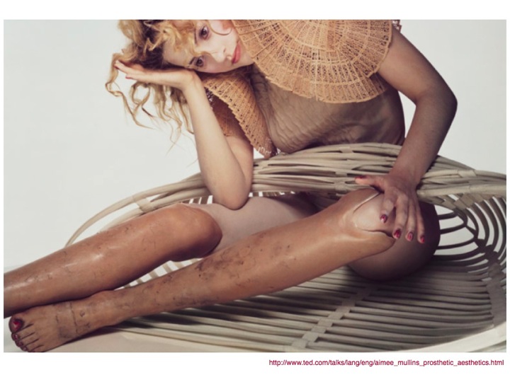
I first heard about Aimee Mullins from a TED talk, where she talked about her 12 pairs of legs. Go watch the video before continuing to read. I don't mind. In fact, I'd actively encourage it. She's an amazing woman. Come back here after though.

A few of Aimee Mullins' prosthetic legs, including some stunningly beautiful carved wooden legs

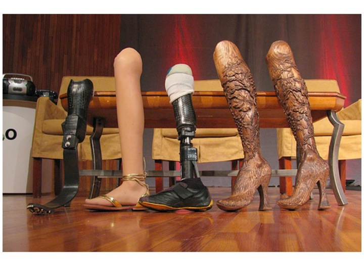
What I found most interesting about her is the notion that the goal for assistive devices or prosthetics should not be merely to replicate "normality", but instead to enhance and augment. Why should people who have a disability always be considered to be lacking in some way?

Why can't more design for specific needs be more integrated with design for "normality"? When it's done well, it can enhance the item, rather than detract from it (which is a common fear amongst designers who are asked to consider the needs of people with disabilities in their work).

L'Occitane products with braille as part of the labels

Braille on wine bottle label

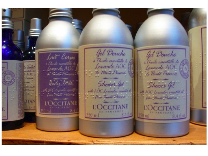
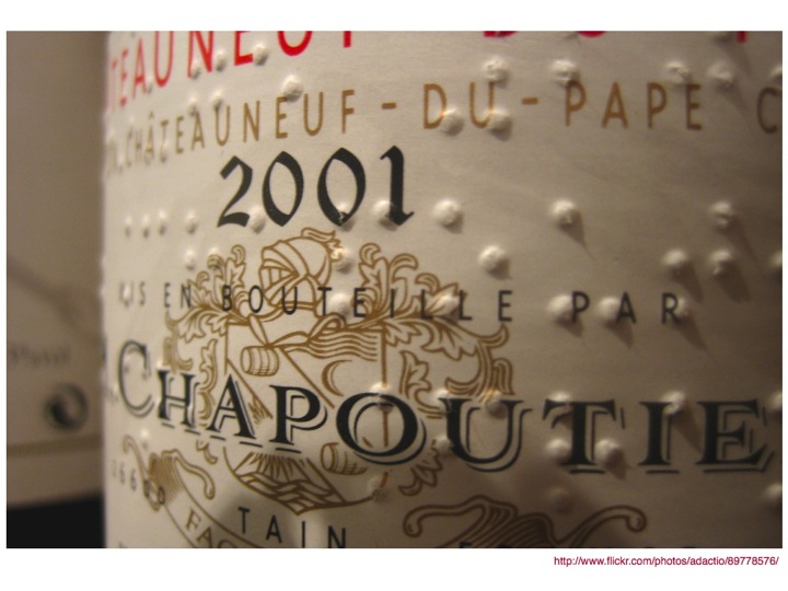
Having Braille on the labels of L'Occitane products and bottles of wine doesn't prevent someone who can't read Braille from reading the text that is also there. It also doesn't (in my opinion) make it look any less aesthetically pleasing. In fact, I think it adds to it (and I'm quite sure I'm not the only one. I've also seen lots of people exclaim over Braille on product labels in shops).

Playboy and Reader's Digest Braille magazines

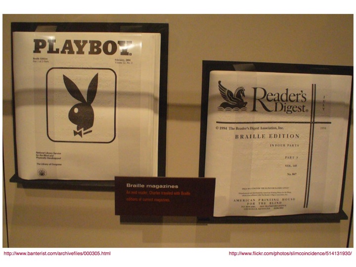
Although it might seem quite difficult to make some items accessible, or available in other formats, with a bit of thought, anything (pretty much) is possible. I still remember my delight when I found out about Braille Playboy early in my career at RNIB.

(as a side note, in searching for a picture of Braille Playboy, I found a great blog post entitled Playboy. In Braille., which is hilarious and well worth a read, particularly for the captions on the images. It makes me laugh just thinking about it.)

A wheelchair ramp on a beach in Australia

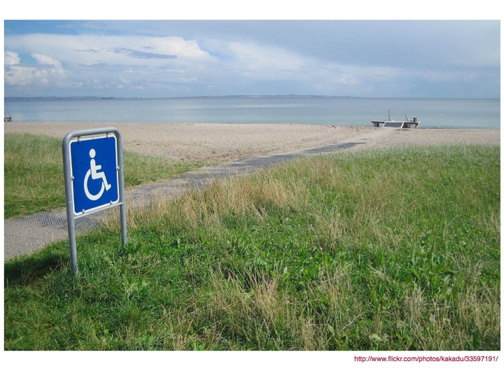
It's truly amazing what can be done with a bit of thought and effort. I would never have thought I'd ever see a wheelchair ramp on a beach, but I was delighted to find a picture of one. How wonderful that people in wheelchairs can experience the sea and sand (and attendant joys and nuisances of those things in combination with skin) independently, without having to rely on being carried, or giving up at the thought of how difficult it might be.

Vatican wheelchair ramp

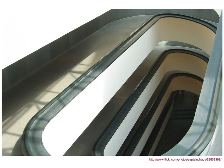
Similarly, it's amazing how beautiful these things can be. I love this photo of a ramp in the Vatican. I think it's a thing of architectural beauty, and I'm glad that they chose to make a feature of it rather than hide it away or install a lift. Now everyone can enjoy it, not just those in wheelchairs and their carers.

Which leads me to the concept of integration. All too often accessibility is tacked on at the end, not integral to the design, and that leads to ugliness, awkwardness and bad design.

Wheelchair ramp integrated with stairs in the USA

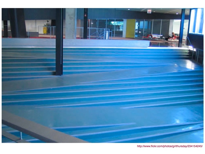
When searching flickr for photos of good examples of accessible design for a previous presentation, I found a picture of a ramp that had been integrated into a flight of steps. I thought it was a genius idea. Those who could use the steps could continue to use them, but those who needed the ramp didn't have to go out of their way (or get out of the way of the step users). Fantastic!

Brunswick Centre Stairs/Ramp, face on

I was still quite excited about this find the next day when I was at work, and when I went out for lunch at the nearby Brunswick centre, as I had done many times before, I had a sudden realisation.

I'd been using something very similar. Pretty much every day. For months.

Without realising it.

The integration was so smooth that it just worked. For everyone. Wheelchair users. "Normal" people. Families with pushchairs. Elderly people with (or without) walking sticks.

It just worked.

Brunswick Centre Stairs/Ramp, side view

Even better, it didn't look ugly either.

There was no "Disabled users go here" segregation.

RIBA stairs with ramp

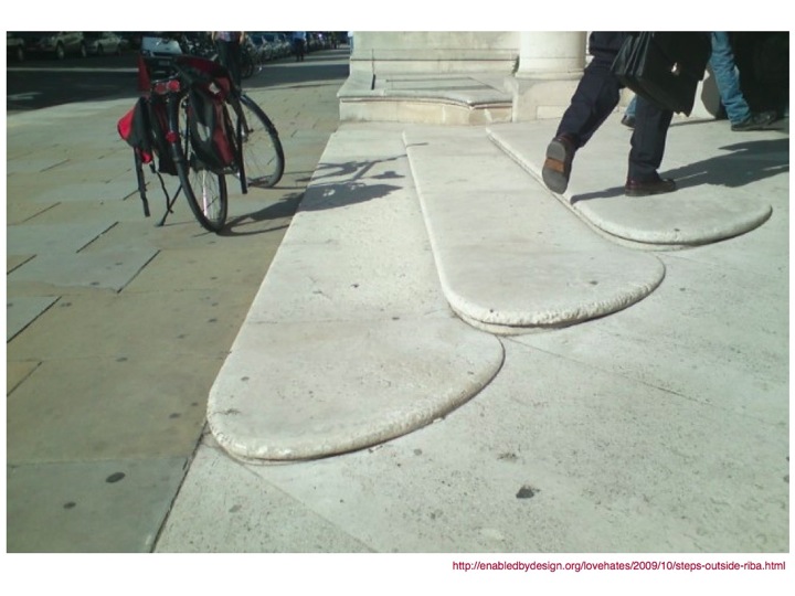
A post on Enabled by Design recently showcased the steps outside RIBA, another lovely example of what can be done when accessibility is integrated into the design process.

Tactile paving in Japan, leading pedestrians around manhole covers

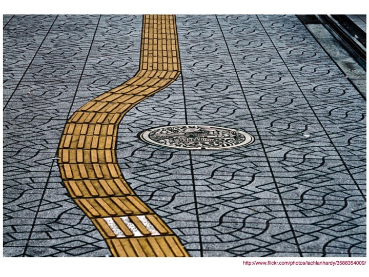
I also love this beautiful example from Japan of using tactile paving to guide people with sight problems around potential obstacles on the ground. In this case, pedestrians can, without any irony, follow the yellow brick road and in the process, avoid (in this case) potentially falling down (or tripping on) a manhole cover.

Bus stop pavement ramp in Bristol

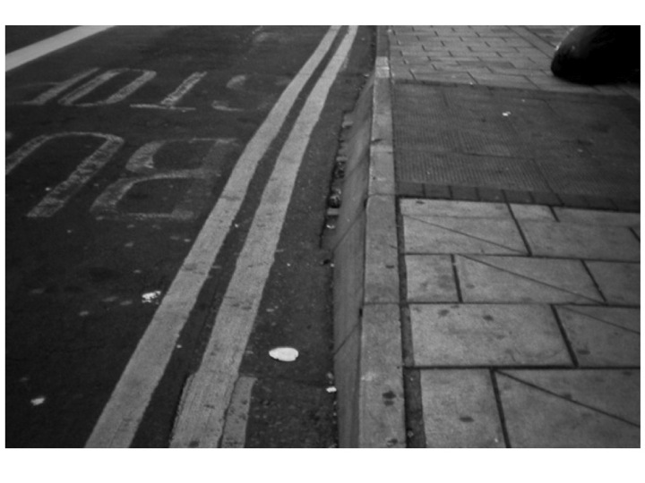
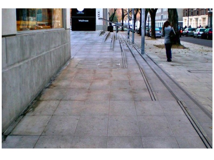
When I was in Bristol recently I had cause to use the local bus service, and it was only after three or so days of using it that I realised why the buses stopped in particular places.

At pretty much every bus stop I saw, there was a ramp built into the pavement, making it easier to get on and off the bus for everyone, never mind those with pushchairs or wheelchairs.

The ramps weren't an eyesore as they were built as part of the pavement, and they didn't stop anyone from using the pavement either.

A great example of design for a specific need that has wider benefits.

Oxo Good Grips Swivel Peeler

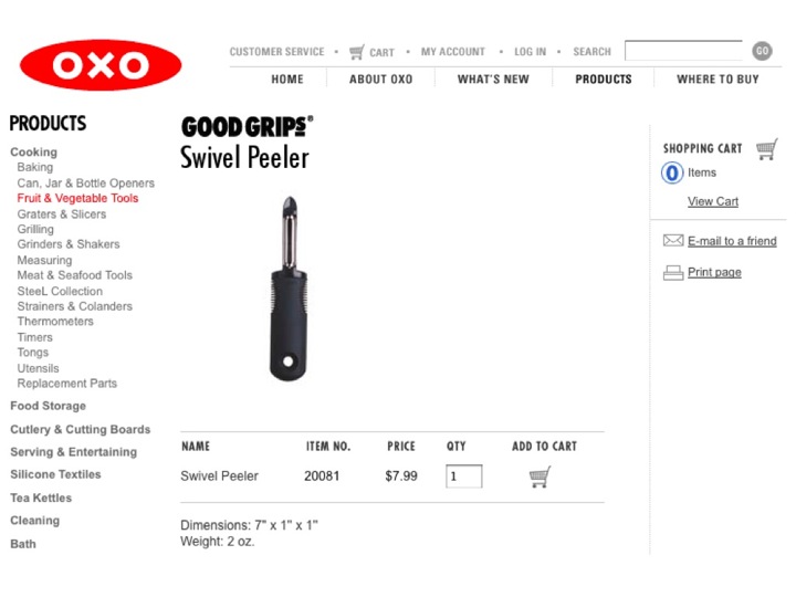
I love the OXO Good Grips range of kitchen tools.

The inspiration might have come from a wish to alleviate the discomfort of arthritis, but the products aren't marketed as being for disabled people, or even to alleviate disability problems.

OXO Good Grips case study from the Design Council

Oxo Good Grips Swivel Peeler marketing copy

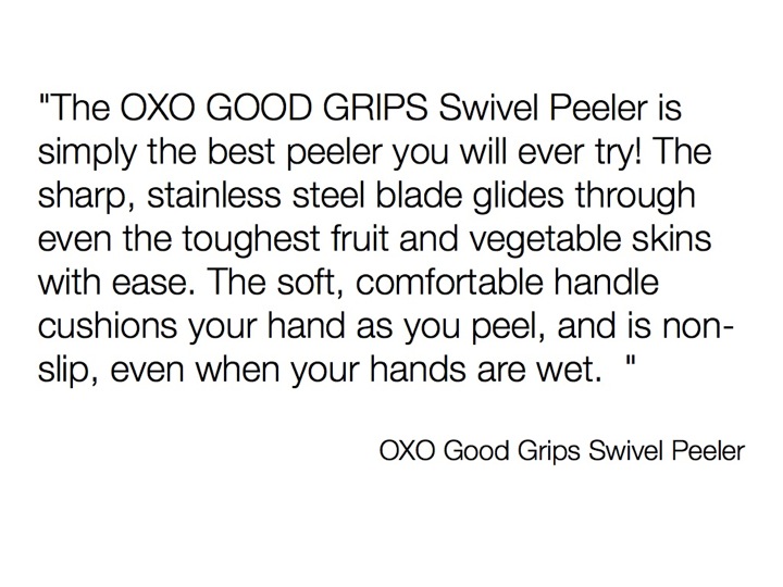
The OXO GOOD GRIPS Swivel Peeler is simply the best peeler you will ever try! The sharp, stainless steel blade glides through even the toughest fruit and vegetable skins with ease. The soft, comfortable handle cushions your hand as you peel, and is non-slip, even when your hands are wet.

Nowhere in the marketing copy does it mention the need to have a problem to buy or use the product. Instead it focuses on the benefits to the end user.

Carsonified Events Page

It's not just the built environment where this integration can take place. It can (and should) be implemented online.

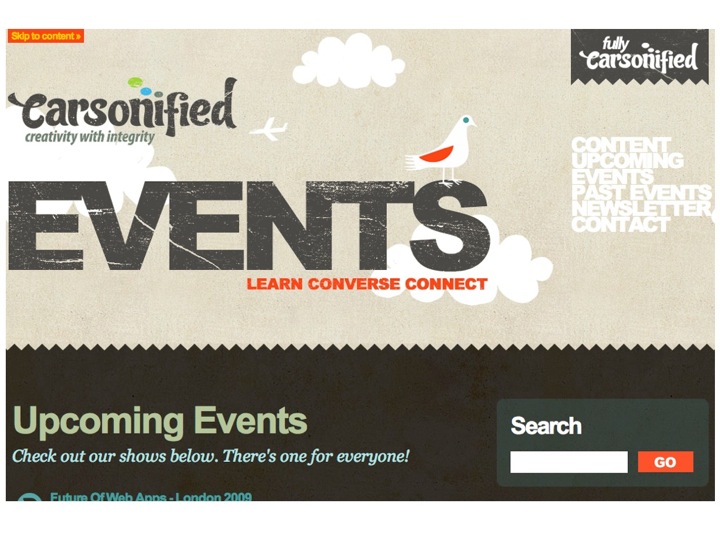
I probably wouldn't go as far as to claim that the Carsonified Events page is the ultimate in accessible design, but it was the first seriously high profile site aimed at the design community that I've seen implement a visible Skip link.

It doesn't get in the way for those who don't need it, but could be a real boost for people who can see just fine and can't use a mouse, enabling them to jump over any navigation links.

Guardian Home Page

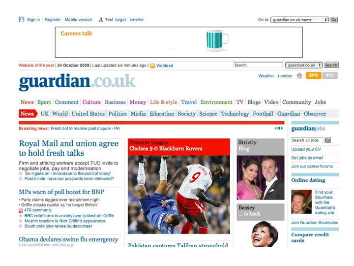
The Guardian website has a really nicely implemented text resize widget. Clearly visible, and available to any and all who might need it. Yes, the use of text resize widgets is still controversial in the web accessibility community, but it can be a useful usability aid. Not everyone needs to use it, but equally it doesn't harm anyone else's experience by being there.

Legal & General Home Page

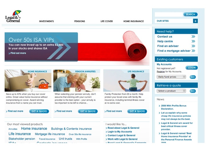
Which brings me on to the Legal & General website. It isn't boring and ugly, the all too often expected hallmark of accessible/inclusive design.

It's no longer news in the accessibility community, but it remains the best example of a solid business case for including accessibility as part of the design process.

Just a snapshot of some of the figures from Mike Davies' Presentation to the London Web Standards Group meeting.

Legal & General Home Business Case for Accessibility

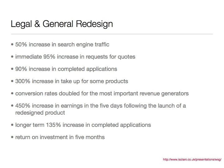
  • 50% increase in search engine traffic
  • immediate 95% increase in requests for quotes
  • 90% increase in completed applications
  • 300% increase in take up for some products
  • conversion rates doubled for the most important revenue generators
  • 450% increase in earnings in the five days following the launch of a redesigned product
  • longer term 135% increase in completed applications
  • return on investment in five months

In the current financial climate, I honestly can't believe that any business can afford to ignore figures like these. The increase in sales as a result of making the site accessible didn't, for the most part, come from people with disabilities. It came from "normal" people. Making the site easier to use for people with disabilities made it easier to use for everyone, and as a result, more people bought the products.

If you're designing, building, making, selling anything, why wouldn't you want even more people to find it, read it, use it, buy it, think it's awesome?

Inclusive Design != (does not equal) Ugly

As I hope I've shown, Inclusive Design doesn't have to be ugly. It can be a thing of beauty that's a delight to use, whoever happens to be using it.

Accessibility = Extreme Usability (kind of)

It's easy to say, but I do think that Accessibility is kind of like an extreme form of Usability. If a product is easy to use by people with impairments, it is highly likely to be easier to use by people who don't have impairments.

Ok. How?

It's no use me saying that people should design sites (or whatever) for a wider audience without giving some hints and tips on how this can be done.

For the purposes of this, I'm talking about websites or computer interfaces, but a lot of this can be applied to other things.

It's also necessarily brief and high level. For more detail, you could have a look at Designing Accessibility Into Themes, which I wrote earlier this year for the Drupal 7 User Experience project or contact me for some training or consultancy.

Good typography

If you want people to read your content/buy your stuff, you need to make sure they actually can. Good typography is incredibly important. Choose an appropriate typeface, ensure that the text is of a decent size (and can be resized), ensure that there's sufficient contrast between the text and the background colour and a decent amount of space between lines (but not too much).

Pretty

Make it pretty. Don't be afraid of using colour and images to make things look better. Pretty things make people happy. Happy people are happier, and often buy more stuff.

Just make sure that while you're making it pretty, you're not making it more difficult to read and/or use.

Clear and simple language

Use clear and simple language (where appropriate). The easier you can make it for people to understand what you're offering and what benefit it can bring to them, the better. Obviously, this doesn't apply to scientific texts or suchlike, but if you're selling a product or a service, making it easier to understand can only broaden your audience and by extension your client/user base.

Instructions before tasks, not after

One of my pet hates with form design is this proto-convention which has developed which places the form label above the input, and any help text after or below the input.

It just doesn't make sense to give the user the information they need after they need it. If you need a user to take a specific action, or give you a bit of information in a specific format, tell them before they enter it.

I know it might seem obvious, but it's still far from the convention, and I'd like to see that change.

Keyboard only

Make sure your interface works with keyboard only as well as with mouse. In fact, unplug your mouse (and/or disable your trackpad) and spend some time using the keyboard only.

It's not the be-all and end-all, but if your site works without needing to use a mouse, you're a good way towards it being more accessible and easier to use (and I can pretty much guarantee that you'll find at least one thing that will make you rethink your interface).

Progressive enhancement

Design a really good base interface. Make sure that the user experience for people who don't have or can't use a mouse, javascript whizzbang whatevers and all the rest of it is a good one, then build on that rather than try and retrofit functionality based on all the shiny and whizzy interface bits you've designed. It'll be far more difficult and it's more likely to lead to compromises in the visual design.

Anyone using the base interface shouldn't feel like they're missing out on something.

It's far easier to start from a good solid base and then iterate, adding nice functionality and interactivity along the way (making sure that whatever you're doing isn't making whatever it is more difficult to use).

For example, if you're building a user interface which displays styled tooltips when you hover your mouse over a particular element, think how those elements could be incorporated into the design if you don't have javascript/whatever available. Are they important or are they nice to have? If they are important, then design them into the base interface. If they're not important, it's fine to have them not appear. It's also really important to duplicate any hover-based functionality so that it appears when the item is given focus so people who can't use a mouse can still use it.

This isn't just for people with disabilities - iPhone (for example) users can't make content appear on hover when they're looking at a website in mobile Safari.

Thank you

One final story. A few years ago RNIB held a series of awards, one of which was for Best Website. It was to be nominated for and voted on by blind and partially sighted people. We thought that it might throw up some really fantastic accessible websites that we didn't know about, and allow us to use them as examples of how great these could be.

We were wrong.

The sites that were most nominated were sites like play.com and Amazon. This was before the lawsuit requiring Amazon to make their site more accessible to blind and partially sighted people, when most of the images on the site didn't even have alt text. Not exactly a shining example of accessibility. What it had going for it was compelling content. People wanted to use the site so much that they'd found or developed coping strategies that would enable them to use the site.

Coping strategies are all well and good, but we don't all offer something as compelling as cheap books and CDs, and users may not put the effort in to find workarounds for accessibility or usability barriers. More often, they'll go somewhere else if they can.

At the end of the day, inclusive design is a real opportunity to bring the awesome that is your creation to a wider audience, and really, why wouldn't you want even more people to love/read/buy your stuff?

If you're interested in reading a bit more about inclusive design, I can heartily recommend reading Design Meets Disability by Graham Pullin

If you've read this far, thank you. I could have gone the easy route of just throwing the presentation slides up on slideshare or recording a screencast, but neither of those felt like they would particularly capture the essence of what I was trying to convey with my talk. Hopefully, this does a good enough job.

Jump back to the top (without miles of scrolling)

About Accessibility Pages

A while ago, I asked a question about accessibility help pages on twitter, and even set up a poll, asking "Where on the page do you put your accessibility help link?". I gave four options, and the results were as follows:

  • At the top, in the first few tabs/links. 44% (35 votes)
  • At the bottom, in the last few tabs/links. 25% (20 votes)
  • What accessibility help link? 29% (23 votes)
  • Other 1% (1 votes)

I've been meaning to blog about it for ages, and was reminded about it again today, when I looked at three or four sites in a row which had accessibility help links as the very last link on the page.

I then posted to twitter that I:

would love to see stats for how many views accessibility statements/pages that are linked at the very end of page get, vs top of page.

I was really pleased when @AndyDBryant replied:

@pixeldiva If it can wait til tomorrow, I can dig out stats for my employer's site (accessibility link at bottom). What kind of time period?

I wasn't expecting any particular answers to my tweet, I was really just thinking out loud, but I really would love to know how many page views accessibility pages get, regardless of their positioning.

I have a few theories about them, but I'd like a bit more data before I expand on what they are, which is where you come in.

If you work on the web, have access to statistics and have an accessibility page, I would absolutely love it if you could give me the following info:

  1. Where on the page your accessibility page is.
  2. How many views your accessibility page has had in a given time period.
  3. How many views your home page has had in that time period.
  4. What that time period is.

If you can give me the name/url of the site that would be awesome, but if you can't for whatever reason, that's fine.

You can also use a fake name along with your comment if you feel the need, but I'd really appreciate it if you used a real email address (it'll only be seen by me, and I won't use it for evil, promise) so that I can contact you for further info (if you're happy for me to do that).

If you really feel uncomfortable posting stats publicly but still want to share, you can email me instead.

Thank you.

Pumpkin Soup

Roasted Pumpkin

In another time and another life, autumn became more than it had ever been to me. It became a magical time which meant shorter days, longer nights, chilly ears and, often, a sojourn to another country where there Americanisation of Halloween lent its magic to a (mostly) peaceful landscape where I could rest, read and recharge for a few days surrounded by a family that, though not mine, had nonetheless warmly welcomed me.

I wrote that a year ago, almost to the day, in a post on the (somewhat mothballed) previous version of this blog, entitled "Reclaiming Autumn", where I talked about how I came to love, lose and reclaim Pumpkin Soup as my talisman of Autumn.

I'd forgotten the exact date I wrote that, until I went to look for that post when writing this one, and had a bit of a laugh to myself, because it was exactly a year and one day later that I made Pumpkin Soup again.

This year's audience was mostly the same as last years (minus a brother-in-law to be) but the soup was extra special, because among it, was the pride of my foray into growing my own veg - a home grown pumpkin.

Pumpkin Soup (some assembly required)

Of all the veg I grew this year, the pumpkin was special. Yes, fresh salad is nice, home grown strawberries are lovely and eating baby sweetcorn right from the plant is fun, I'd have forgone them all for my pumpkin.

It's been sitting in the kitchen for a few weeks now, ripening nicely among its larger, shop-bought cousins (a pumpkin a day makes Ann a ridiculously happy girl, especially given their short period of availability) and part of me wanted to keep it, I'd spent so long growing this thing that I had to know if it was actually a real pumpkin inside, so with a wee bit of a lump in my throat, I cut it up, ready to roast, and thence, to become soup.

Ready to roast pumpkin

When I wrote about pumpkin soup last year, a few people asked for a recipe, and at the time I couldn't provide one, because I hadn't written down what I'd done, so this year, I paid attention.

I should point out that this is by no means a tested or scientific recipe. I don't tend to do weights and measures, so your mileage may very well vary.

Pixeldiva's Pumpkin Soup

Ingredients

Pumpkins (I used 3, around 1kg each) Shallots (5 medium sized ones) Garlic (1 bulb) Stock (I used chicken, but you could use vegetable, if you're that way inclined) Herbs de Provence (about 2 teaspoons) Cumin (about 2 teaspoons) Cinnamon (about 1 teaspoon) Salt Pepper Butter Olive Oil Double cream (for serving)

Method

Cut each pumpkin in quarters, and scoop out the gunk in the middle. Then cut each quarter in half again, so you have eight pumpkin wedges per pumpkin. Lay these out on a baking tray or roasting dish, and scatter about a bulb's worth of garlic cloves around the pumpkin. Drizzle some olive oil over the tip, scatter some salt, and put in an oven that's been pre-heated to 200°C for about 30 minutes, or until nicely roasted.

Finely chop the shallots, and gently fry them with a wee bit of butter and olive oil in the bottom of whatever pot you intend to make your soup in.

Peel the skin off the pumpkin (it should come off reasonably well with the aid of a reasonably sharp knife) and put the mushy pumpkin bits in the pot with the shallots. Then grab the roasted garlic cloves and squeeze their innards into the put too.

Throw in some herbs de provence (or mixed herbs), cumin and cinnamon and mush the whole lot up, before adding enough stock to cover the mush, plus about half an inch of water above (sorry, I know that's not a very exact description).

Let this simmer for a while until it goes even more mushy, and then taste. Season with salt and pepper (and more cumin or herbs) if you feel it needs it. Otherwise, get your hand blender out and try not to cover the kitchen in soup while you get carried away with the joy of blending.

Serve with a dribble of cream and a grind of black pepper, and enjoy.

This makes enough for four people, with enough left over for a large bowl later, when lunch or dinner is a distant memory and handknit slippers and crocheted lap blankets (or your equivalents) aren't quite enough to keep you warm.

Late evening snack

Hand-written Business Cards

Hand Written Business Cards (v2) A few weeks ago, just before I headed off to Bristol, I decided to go a bit earlier, and catch FOWD Bristol.

Then I realised that I was running out of Moo Cards and had absolutely no time to order any more.

Disaster.

After casting around a bit, I remembered that I have craft supplies and quite the collection of pens, and decided to just make something.

I grabbed my hypotrochoid art set (which I did actually buy from the SFMOMA gift shop (I love a good museum gift shop, oh yes…)), some white cards (I think they were supposed to be place cards for a wedding or somesuch), my round corner cutter and my set of Stabilo Pens.

That was the easy bit.

Deciding what to draw, where, using what colours was the easy bit. I grabbed a bit of scrap paper (back of an envelope I think) and tried out a few patterns until I found the one I liked best. Then I chose the colours. Purple first (because its my favourite colour), granny smith apple green next (because I have developed an inexplicable fondness for this most difficult of colours) and finally, pewter grey (because I like it more than black). Sorted.

I'd decided to make thirty cards, ten in each colour, but hadn't considered the possibility of cramp from doing so many spirals. My hands and arms started to cramp up by the fourth card. Doing thirty perfect spirals is harder than it looks.

Once the spirals were done, I realised that I needed something more and added the "Hello!" and it was then that I hit upon the idea of using the fold in the card to get around the problem of figuring out which card to give people at these kinds of events, business or personal. I used to carry around two sets of cards, particularly when I worked at RNIB, and was never particularly comfortable with the decision making process of who should get what card when the event wasn't strictly a work event. It didn't get any easier when I went freelance either. I have a set of Moo cards that I made when I first set up my business site, but I then changed the branding so I couldn't use those, and anyway, I'm more than what I do for work.

So, whatever I did needed to work as a business card and a personal card. A me card, if you will. Some people might want to know more about my work, some people might want to know more about me. Some people might go from one to the other. Best to give them the option rather than making that god-awful networking deliberation about how "useful" people might be in terms of giving you work.

It was at that point something went ping in the back of my head, and I remembered having books which could be read from either side. One story started from the front, one from the back. To read either, you just turned the book around and started whichever one you wanted.

So I turned the card around and wrote "Hello!" on the other side. It felt like it needed a bit more, so I added the little arrow.

At this point, I started getting that little buzz of "y'know, this might just work…"

It was decided. You could open the card from either side and get either my work or my personal contact details like one of those start from either end books.

Then I got to the hard bit. The actual words. This probably took the most time of the entire process. Even though my handwriting is terrible (as a result of typing for a living for more years than I care to count), it actually took longer to decide what the words were going to be than it took to write them out twenty times. You'll notice that number differs from the number of cards above. That's because it hurt my hand so much that I just couldn't write any more. So I left the apple green ones and figured I could find a quiet moment to write them up at the conference or whenever, and anyway, I wasn't likely to hand out more than twenty cards, even taking into account the speed networking session.

Job done, I took a photo and uploaded it to flickr to try and stave off any chance of me deciding, in the cold light of day, that they were crap and should be consigned to the bin.

Business Cards (for FOWD Bristol)

Happily, they went down quite well, and to my immense surprise, I actually needed the apple green cards. So much so that by the time I came back from Bristol four weeks later I was all out of cards and needed to make some more.

I'm not sure these cards would work in all situations, and I may yet wind up getting "proper" business cards printed up, but for the moment at least, I think I might continue to use these for situations where the lines between business and personal aren't entirely clear.

What's up with #missingbodybackgroundwatch

I wrote a post the other day sharing a tiny tip that makes testing websites easier (go read, it's short, I'll wait), and in that post, called out the first site that I found that had a missing body background colour. Since then, I've spotted a quite surprising number of sites that have the same affliction and have (mostly for my own edification, and with half a mind on a blog post further down the road) been posting each site to twitter using the hash tag #missingbodybackgroundwatch and today, a couple of people asked what it was all about.

So. A bit of explanation.

Working with a changed colour scheme was, for the most part, not a problem… unless the site in question had specified the text colour to be a similar shade grey (or anything else that was quite light) at which point the entire thing became almost entirely unreadable as the colour contrast all but disappeared. Doh!

A better example would be a site that specified black for its text and neglected to set white as the background colour. If anyone visits using a browser set to the default colour scheme (or using Windows or Mac default colour schemes) that'd be fine, but if, for example, someone was using a high contrast reverse colour scheme, the default browser background colour would more than likely wind up being black, combine that with black text, and it just doesn't work.

Since a picture is worth a thousand words, here are three screenshots that illustrate why it's a problem.

The site in question is the New Statesman (I can't remember why I was looking at it - probably followed a link from twitter).

New Statesman (Standard Browser Default Colour Scheme) Example 1: New Statesman viewed using the standard Firefox (cos that's what I use) default colour scheme. Looks fine, right?

New Statesman (Different Colour Scheme) Example 2: Viewed using a different background colour (to imitate a different colour scheme). I chose pale green because it illustrates my point better than grey. It doesn't look too good, but at least it's still readable.

New Statesman (High Contrast Reverse Colour Scheme) Example 3: Viewed as it would be if a user had chosen a high contrast reverse colour scheme. Some text is readable, but lots of it isn't (which is a bit of a problem for a newspaper/magazine site.

It's such a tiny thing, but the impact can be huge.

So, if you're going to specify a text colour, make sure you've specified an appropriate background colour too. That doesn't mean that you have to specify a background colour on every element. Provided that somewhere underneath your text you've specified a background colour that has sufficient contrast against the text colour, you can let the cascade do its thing.

Obviously, if you decide to change to using light text on a dark background in an area where the rest of the site is dark text on a light background then you'll need to specify both.

Oh, and make sure that wherever you use background images that you back them up with an appropriate background colour as well. Otherwise, all that lovely contrast disappears if, for any reason, images are not available.

I'm going to keep collecting sites with a missing body background colour, do a bit of research and write a post about it in a wee while, so in the meantime, if you feel like it, change your background to something else (in Firefox, you'll find it in Preferences, Content, Colours, then click on the box next to Background and just pick something else from the handily provided swatch) and if you spot any, it'd be ace if you'd post them to twitter using the #missingbodybackgroundwatch hash tag.

Eight Years in London

All this Bristol malarkey has taken over my brain to the extent that my eight year anniversary of moving to London passed without thought or remark. So much has happened since I got in that van with my sister on the 28th of September 2001 and we set off for points south (me to London, her to Dover).

I realise that I've now spent almost a quarter of my life in London, and until recently didn't see a life outside of it, but it's funny how the world turns…

If you'd asked me six months ago where I thought I'd be living in eight years time, I'd probably have said London.

Now?

Who knows. I certainly don't.

I'm looking forward to finding out though.

This moment in this place

It's the 1st of October. I'm not entirely sure how that happened. It seems like only a minute ago it was July and we were off to San Francisco on the holiday of a lifetime.

I'm in Bristol, doing some work for a local digital agency. I've been here for three weeks now and those three weeks have exceeded any and all expectations I had on accepting the contract.

As I write this, I'm sat on a bench at a picnic table alongside the SS Great Britain looking across the floating harbour. The sky is blue with only the merest hint of fluffy cloud and the sun is warming my back. A light breeze stirs the weeds between the cobblestones below and gently ruffles my hair. Some workmen at the next table are laughing and joking and the noise from the construction nearby is barely audible over my music and the hum of the Matilda of Bristol's engine as she putters in to the side to pick up a passenger before moving off again.

A picture may be worth a thousand words but there isn't a camera in the world—nor are there enough words—to fully describe the myriad of details that make this moment in this place so perfect.

Life is short and moments like this frustratingly few and far between. Sometimes the most important thing is to stop.

Take a breath.

Look around.

Do whatever it takes to be fully in the moment.

It really is a beautiful world.